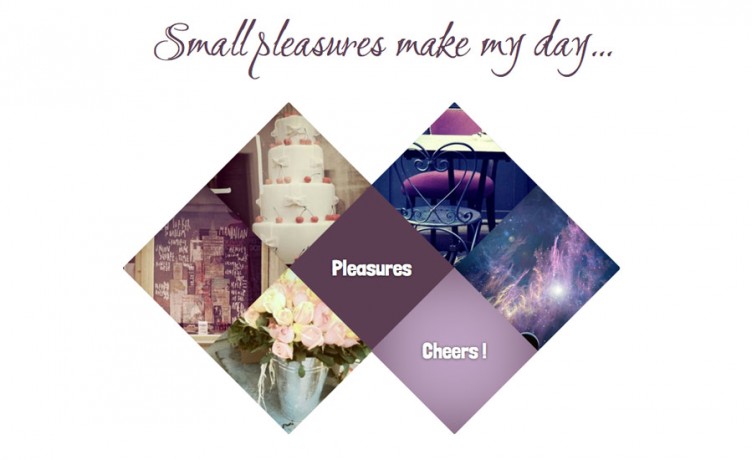
We got used to standard grids and clear horizontal and vertical axes. No wonder that the eye-catching layouts based on the diagonal lines have become one of the recent trends in web design. In this tutorial we will create a very simple diagonal thumbnails gallery.
We will use css3 2D-transforms and pseudo elements to display the diamond-shaped elements with a background image.
Note that to keep the code below concise I omit the vendor prefixes before “transform” and “transform-origin”.
Step 1 Prerequisites
To recreate the demo gallery you will need 6 images (mine are 250px x 250px) stuck together into one sprite (mine is 1500px x 250px and you can see it right below).
![]()
Step 2 A single diamond
Here is the markup for a single diamond thumbnail. I use two classes : “.diamond” to rotate an element and “.thumb” to add some background image (note that the middle square has no background image, it has only the “.diamond” class, see the demo).
<a class="diamond thumb" id="cake" href="">
   <p>A cherry</p>
</a>
Step 3 Rotate a square
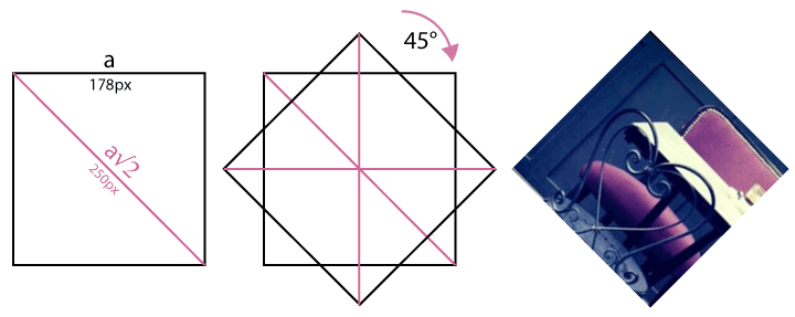
Let’s start writing some css. Why 178px? The diagonal of our square is 250px (the dimension of an image), so the side must have 250px divided by a square root of 2 (have this “back to school” feeling ?).
.diamond {
  display: block;
  width: 178px;
  height: 178px;
  background: #5c3e52;
  transform: rotate(45deg); }
.thumb {
  background: url(../images/sprite.jpg);
  position: relative;
  overflow: hidden; }
.image p {visibility:hidden}
Step 4 Rotate the background image
We rotated the square but its background image got rotated as well, and this is not a desired effect. We’ll “fix” it using an :after pseudo-element.
.thumb:after {
  content: "";
  position: absolute;
  top: -36px;
  left: -36px;
  width: 250px;
  height: 250px;
  background: inherit;
  transform: rotate(-45deg); }
In the image above you can see how our .thumb:after is positioned. It inherits the background of its parent and its parent has overflow set to hidden so we’ll see exactly the parent’s diamond shape. The rotation we applied has the opposite sign, so it reduces to 0 and we see an unrotated background image.
Step 5 The gallery
I used floats to create my small gallery of thumbnails but you can also position your thumbnails absolutely.
The html is as follows :
<div class="wrap">
	<h1>Small pleasures make my day...</h1>
	<a class="diamond thumb  intend" id="cake" href="">
		<p>A cherry</p>
	</a>
	<a class="diamond thumb dark" id="chair" href="">
		<p>An espresso</p></a>
	<a class="diamond thumb break"  id="library" href=""><p>A book</p>
	</a>
	<a class="diamond" href="">
		<p>Pleasures</p>
	</a>
	<a class="diamond thumb dark " id="dream" href="">
		<p>A dream</p>
	</a>
	<a class="diamond thumb intend" id="roses" href="">
		<p>A rose</p>
	</a>
	<a class="diamond thumb dark" id="wine" href="">
		<p>Cheers !</p>
	</a>
</div>
We have to add some css so that the diamonds stick nicely one to another
.diamond {
  float: left;
  margin-left: 72px; /* 250-178 */
  margin-top: -53px; /* 250/2-178 */ }

.break {
  clear: left;
  margin-left: 36px; /* (250-178)/2 */ }

.intend {
  clear: left;
  margin-left: 161px; /* (250-178)/2 + 250/2 */ }
Step 6 “Cheers !” and others
We want our descriptions to be displayed on a one-color background on mouse hover.
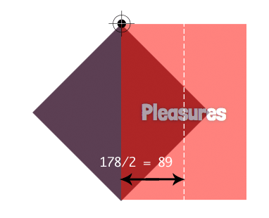
First note that, since our .diamond is rotated so is the paragraph contained within. We’ll have to re-rotate it with an opposite sign.
.diamond p {
  position: relative;
  transform-origin: top left;
  transform: rotate(-45deg) translate(-89px, 0);
  line-height: 250px;
  z-index: 1;
  pointer-events: none }
Step 7 On mouse hover
Here is what happens on mouse hover
.diamond:hover p {
  visibility: visible; }

.thumb:hover {
  background: #a5b8a6; }

.thumb.dark:hover {
  background: #bda3c1; }

.thumb:hover:after {
  box-shadow: inset 0 0 100px #5c705d; }

.thumb.dark:hover:after {
  box-shadow: inset 0 0 100px #5c3e52; }
Step 8 The lack of support
We have to assure a descent display in browsers that do not support css3 transforms. We’ll use modernizr to detect the lack of support and add
.no-csstransforms .diamond {
  margin-left: 0;
  margin-top: 0; }
.no-csstransforms .intend {
  margin-left: 197px; }
.no-csstransforms .break {
  margin-left: 108px; }
.no-csstransforms .diamond p {
  line-height: 178px; }
Step 9 See you soon !
That’s all for today, thanks :) Are you ready for hexagonal shapes ? Stay tuned, we’ll write about it !
Step 10 A little update
Thanks to everyone who reported a bug – the hover effect didn’t work quite correctly. To fix it we need to add “pointer-events : none ” to the paragraphs, i.e.
.diamond p { pointer-events: none }(see Step 6).
Terms of use :
You may use the effects demonstrated in tutorials in your own work, both commercial or non-commercial without any attribution. You may not reproduce entire nor large parts of our tutorials. The outcome of our tutorials may not be re-saled nor redistributed.


IE9 supports some CSS3 transforms by using the prefixed version -ms- transform. Applying that to your tutorial, creates the diamond grid in IE9, basically it is the same as in other browsers. I think you should update the tutorial with those few lines!
Superb post however I was wondering if you could write a litte more on this
subject? I’d be very grateful if you could elaborate a little bit more.
Kudos!
Excellent post. Can you tell us if it can be used in a wordPress site and give us some guidelines on how to do this?
Congrats!
How would I make this mobile responsive?