In this tutorial we’ll create a simple responsive home page with a header embellished with a carousel where photos slide from right to left. Our solution will not require javascript, we’ll make our slideshow using css3 animations – supported by all major browsers: Firefow 15+, Chrome 22+, Safari 5.1+, Opera 12.1+ and IE10.
Step 1 – Prerequisities
We will need 4 large photos, mine are 1200px x 390px. To have a horizontal slider I’ll create a 4800px x 390px image in Photoshop, place my four images one after another in a row and save the image for the web (“slider-horizontal.jpg”).
Step 2 – HTML
In fact we will animate the background-position of our header element. The header has a very simple markup :
<header>
    <h1>L'ile de Batz</h1>
</header>
The complete html is as follows
<!DOCTYPE html>
<html class="no-js" lang="en">
<head>
<meta charset="utf-8">
<meta name="viewport" content="width=device-width, initial-scale=1.0">
<link rel="stylesheet" href="stylesheets/screen.css" media="screen" title="no title">
</head>
<body>
        <header>
                <h1>L'ile de Batz</h1>
        </header>
        <blockquote>
                Maecenas faucibus ....
        </blockquote>
        <div class="content">
           <section class="main">
                <h2>Once upon a time…</h2>
                <p>Aenean lacinia bibendum ...</p>
                <p>...</p>
                <p>...</p>
                <p>...</p>
           </section>
           <section class="links">
                <h2>Links to learn by heart..</h2>
                <ul>
                   <li><a href="http://www.iledebatz.com" target="_blank">Bar & restaurants</a></li>
                                ...
                </ul>
           </section>
        </div>
        <footer>
           <p class="copyright">..</p>
        </footer>
</body>
</html>
Step 3 The “mobile-first” basic css
We will not start with the large screen styles. We’ll follow the mobile-first approach : at first we will define the baseline shared styles and we will add more advanced layout styles destined for larger screens later. Here are the basic styles, you’ll find the complete stylesheet in the “download” files.
body {
  width: 90%;
  min-width: 300px;
  max-width: 1200px;
  margin: 0 auto;
  padding-top: 1em;
  color: #504331
}

header {
  text-align: center;
  position: relative; }

h1 {
  font-size: 2.75em;
  background: white;
  display: inline-block;
  padding: 0 10px;
  margin-bottom: .25em; }

h1:after {
  content: "";
  height: 2px;
  display: block;
  position: absolute;
  left: 0;
  right: 0;
  top: .5em;
  z-index: -1;
  border-top: 1px solid #504331;
  border-bottom: 1px solid #504331; }

.links {
  background: url(../images/map.png) bottom center no-repeat;
  padding-bottom: 177px; }
Step 4 Large screen styles
On large screens we want the .main and .screen sections to be displayed differently. We want the .link section to be 300px wide and positioned as a right sidebar and the .main section to take the remaining space on the left. We will also add a double line separating the sections. We detect the screen width above 1024px with a simple @media query :
@media only screen and (min-width: 1024px) {
  .content {
    position: relative; }

  .main {
    margin-right: 320px;
    padding: .5em 20px .5em 0;
    /*add a double line */
    border-right: 1px solid #504331;
    box-shadow: 2px 0 white, 3px 0 #504331; }

  .links {
    position: absolute;
    right: 0;
    top: 0;
    width: 300px;
    text-align: right; }
}
Step 5 Responsive image in the header
Let’s start to deal with the main part of this tutorial : a responsive css-only slider in our header. First, we will assure that the background image is responsive.
header {
  background: url(../images/slider-horizontal.jpg) 0 bottom repeat-x;
  background-size: 400%;
  padding-bottom: 32.5%; }
With two values in percentage units : 400% for background-size and 32.5% of bottom padding the header background will display properly no matter the window size.
Why 400% ? We have four slides so we want to display 1/4 of the background image in our header “window”, that means that the background size has to be four time wider than the width of the header.
Why 32.5% ? We position our background in the bottom of the header. The height of the background image is 390px, the width of the single slide is 1200px, 390/1200 = 0.325 so the height is 32.5% of the width.

Step 6 Animation
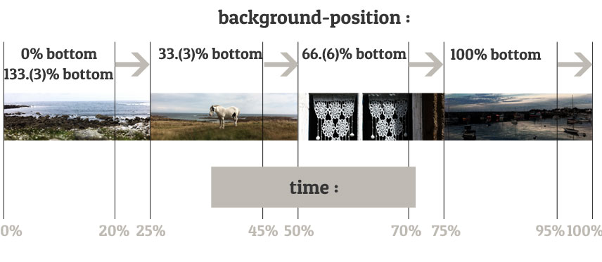
The property that will be animated is background-position. First note that the second image is displayed when background-position is set to 33.33333% bottom, the third – 66.66667% bottom and the fourth – 100% bottom. The first one is displayed when background-position is 0 bottom or 133.33333% bottom (we set repeat to repeat-x).
Each image has its 25% percent of time “of glory”. The first is displayed from 0 to 25%, the second from 25% to 50%, the third from 50% to 75% and the last one from 75% to 100%. Still, we want to see the transition so each image starts to slide off slightly (here 5%) before the end of its 25% of time. Let’s see the @keyframes :
@keyframes h_slide {
  0% {
    background-position: 0% bottom; }
  20% {
    background-position: 0% bottom; }
  25% {
    background-position: 33.33333% bottom; }
  45% {
    background-position: 33.33333% bottom; }
  50% {
    background-position: 66.66667% bottom; }
  70% {
    background-position: 66.66667% bottom; }
  75% {
    background-position: 100% bottom; }
  95% {
    background-position: 100% bottom; }
  100% {
    background-position: 133.33% bottom; } }
Note that you will need to add the vendor-prefixes version @-webkit-keyframes (for Chrome, Safari, iOS Safari, Android browsers) and @-moz-keyframes (for Firefox 15).
The complete header style is as below. Our animation “h_slide” repeats infinitely every 24s (6s for each slide). The timing-function is set to ease-out so that each slide slows down at the end of its transition.
header {
  text-align: center;
  position: relative;
  background: url(../images/slider-horizontal.jpg) 0 bottom repeat-x;
  background-size: 400%;
  padding-bottom: 32.5%;
  -webkit-animation: h_slide 24s ease-out infinite;
  -moz-animation: h_slide 24s ease-out infinite;
  animation: h_slide 24s ease-out infinite; }
Conclusions
That’s all – thank you. Given that css3 animations are now supported by all major browsers and that adaptive layout becomes a “must”, I hope that you’ll find useful the techniques presented in this tutorial. Get inspired.
Terms of use :
You may use the effects demonstrated in tutorials in your own work, both commercial or non-commercial without any attribution. You may not reproduce entire nor large parts of our tutorials. The outcome of our tutorials may not be re-saled nor redistributed.


Awesome tutorial and great this implementation is light on code and free from Javascript. I was wondering if next/previous buttons could be implemented into this too or if it would need Jquery
Simple and Slick, Thank you!
@Brad buttons will need JavaScript … It could be added as an enhancement layer :)
Bravo et merci de nous donner autant. Excellent travail
This is great! The only consideration would be the size of the slider image. While responsive, it would be a large file to download onto a mobile device. A consideration might be whether one could use layers for a similar effect. Nonetheless, a great demo of CSS3, transitions and keyframes. Thanks.
Thank you for this nice sharing;)
Excellent work… You’re doing it right! Easily found, beautiful design, perfect mobile responsive transition on my iPhone, awesome code and creative builds, generous sharing. Wow! Thank you!
I am very learning to code, cn u explain how did u save and where those picture