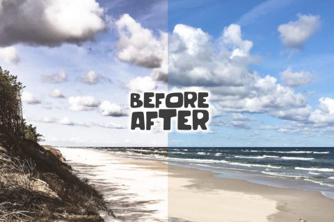
In this tutorial we will try to recreate the scrolling effect you’ve seen on the new e-bay site. We’ll create a simple responsive one-page site presenting the beauty and benefits of lavender. No javascript needed – we will use only css.
Step 1 – Prerequisities
We will need 3 background images, that will stretch to full page width. Mine are about 1800px x 1200px.
Step 2 – Html
The markup is simple. The content of each part is wrapped in a div with a class “wrapper” which is contained within a section or the header (for the introductory part).
<!DOCTYPE html>
<html class="no-js" lang="en">
<head>
<meta charset="utf-8">
<title>From love for lavender</title>
...
</head>
<body>
<header class=" content">
	<div class="wrapper">
		<h1>From love for lavender</h1>
		<p><span>Lavender</span> (botanic name Lavandula) is a ....
		</p>
	</div>
</header>

<section class="content" id="oil">
	<div class="wrapper">
		<p><span>Lavender oil</span> is an ... </p>
	</div>
</section>
...
<footer>
 	<div class=wrapper>
		 "From love for lavender" has been built ...
	</div>
</footer>
</body>
</html>
Step 3 – basic css
The wrapper class is defined as follows. The box-sizing property allows to alter the default CSS box model, i.e. content-box model, where the width and height properties are measured including only the content. If we set box-sizing to border box, the width and height include the padding and border.
.wrapper {
  width: 100%;
  margin: 0 auto;
  -webkit-box-sizing: border-box;
  -moz-box-sizing: border-box;
  box-sizing: border-box; }
Since we want each section and the header to behave responsively, we’ll use only percent units. For example : the background image for the first section in 500px width, which represents 500px/1200px x 100% = 41.66667%
#oil .wrapper {
  background: url(../images/lavender2.jpg) 4.16667% center no-repeat;
  padding: 10% 4.16667% 10% 50%;
  background-size: 41.66667% auto;}
The value of 4.16667% corresponds to 50px when the wrapper has its maximum width.
We’ll treat the case of larger monitors with a media query :
@media only screen and (min-width: 1200px) {
.wrapper {
    width:1200px; }
........
#oil .wrapper {
    padding: 120px 50px 120px 600px; }
You’ll find the complete stylesheet in the download files.
Step 4 – the scrolling effect
We don’t use any Javascript, our scrolling effect is obtained purely with css. We don’t want any additional markup, so we will use the :after pseudo-elements. They’ll be positioned below each section and covered with the background image. We will set the background-attachment property to fixed. We’ll also add sole inner shadow to give the illusion of depth :
section:after, header:after {
  content: "";
  display: block;
  height: 400px;
  width: 100%;
  background-size: cover;
  background-position: center center;
  background-repeat: no-repeat;
  background-attachment: fixed;
  box-shadow: inset 0 0 10px rgba(0, 0, 0, 0.6); }
We just have to assign the background image to each section
header:after {
  background-image: url(../images/lavenderbg1.jpg); }
#oil:after {
  background-image: url(../images/lavenderbg2.jpg); }
#culinary:after {
  background-image: url(../images/lavenderbg3.jpg); }
#dried:after {
  background-image: url(../images/lavenderbg4.jpg); }
Step 5 – last tweaks
Since background-attachment:fixed is not supported in mobile Safari we’ll add the following media-query
@media only screen and (min-device-width: 768px) and (max-device-width: 1024px), only screen and (min-device-width: 320px) and (max-device-width: 480px) {
    section:after, header:after {
      background-attachment: scroll; }
}
We will also scale down the font-size for smaller monitors
@media only screen and (max-width: 600px) {
  body {
    font-size: .75em; }
}
And that’s it! I hope you’ll find this technique useful, don’t hesitate to go further – this tutorial is just an inspiration. Looking forward to your comments. Thanks.
Terms of use :
You may use the effects demonstrated in tutorials in your own work, both commercial or non-commercial without any attribution. You may not reproduce entire nor large parts of our tutorials. The outcome of our tutorials may not be re-saled nor redistributed.


Wow! Really nice effect. Thanks a lot for sharing.
Yep, amazing, thanks for sharing your knowledge :)
This is awesome :D I’m so glad I found this tutorial!
Looks just great. Have someone tried it with anchor links to scroll down to sections of the page?
mmm, i was thinking about this as weel, did you solved it?
Completely amazing! Thanks a lot for this sharing. You can with interne anchor like an another design
It’s a plaeusre to find someone who can think so clearly
thanks a lot. I’ll follow you every day.
Regards
Wow. All I can say is wow. Very nice. Definitely going to be using this in the future. And this is a blog to follow!
Did this a few months before ebay launched their site: http://kevinlorenz.com/foto-tutorial/ ;)
Includes smooth anchor scrolling. It was just a sideproject so dont look to close there are may some bugs ;)
This has made my day. I wish all pogtniss were this good.
Great tutorial. Nice way to use the pseudo class.
Beautiful.
neat effect but scroll doesn’t work properly on a Kindle Fire, Galaxy s3 doesn’t show the background images, and Android 2.3 had the background images displaying weird but scrolling functioned okay.
in this post i got tricky things and techniques to enhance my skills. you did appreciated work.
How can you do that but scroll left to right instead of top to bottom?
This is an awesome effect, makes me wanna redesign my project, your tutorial has just inspired me. Thanks!
Thanks a lot, you have demystified this effect, i thought that it was way more difficult to accomplish.
You’re awesome.
Great tutorial, simple and easy to understand. Keep up the good work, thank you !
The fixed background does not appear to work on iPad tablets, or on Android tablets when viewing with Chrome. (The fixed background works with Android Dolphin browser.)
Is there a way to make this work with iPad tablets and Chrome on Android tablets?
Thanks a lot ! I have learned a lot from you.
Thanks a lot for sharing your knowledge, this tutorial was really inspiring. I’m using what I learned here to write a WordPress theme that I’d like to put in the WP.org theme repository.
I hope there’s nothing wrong with that, of course I’m referencing your website and your work both in the main css and with a note in the footer of the theme.
Thanks a lot again, your website is a great showcase of your talent.
Thank you! :)
I would like to have a smaller frame in between, like this: http://www.flickr.com/photos/99159606@N06/9321595377/. Is it possible with your code?
Hi, yes, it’s possible to add some overlying content.
I am working on a parallax site and went through your blog. Nice tutorial and thanks a lot for sharing. But the background parallax effect is not working for monitors less than 1024px. Any suggestion?