I have a weakness for scrolling effects, I haven’t got fed up with parallax and I don’t mind scrolling up and down and from right to left and see what happens.
Recently I got impressed by the James Bond 007 Cars Evolution by Evans Halshaw. Don’t miss it if you haven’t already seen it on your desktop (the mobile experience is not the same).
James Bond 007 Cars site uses a very nice plugin skrollr.js by Prinzhorn.
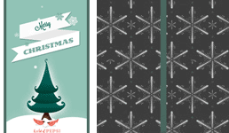
In this tutorial I’ll use this plugin to create a funny Christmas card, I take a risk to make a very “seasonal” tutorial (it’s snowing outside). Easily, you can adapt the same techniques for your purpose.
This tutorial doesn’t cover all possibilities of skrollr – I just want to show you how easily you can add scrolling effect to your site, without even touching javascript. You’ll find much more in Prinzhorn’s repository on Github.
Step 1 Prerequisites
In this example I use 6 background images, two of them being repetitive patterns and a transparent .png with snow flakes that I’ll use for a subtle animation. I also created a simple .svg containing two paths (left and right part of a simple ribbon bow). I drew my paths in Illustrator, saved as SVG and copied the SVG code. But, if you don’t feel like using SVG here – skip this part.

Step 2 HTML
<!DOCTYPE html>
<html>
<head>
	<meta charset="utf-8">
	<title>Merry Christmas - Merry Scroll</title>
<link rel="stylesheet" href="stylesheets/screen.css" media="screen" title="no title">
</head>

<body>
	<div id="skrollr-body">
		<div id="wish1" class="centered"></div>
		<div id="wish2" class="centered">
			<div id="snow" class="centered"></div>
		</div>
		<div id="ribbon-left" class="ribbon"></div>
		<div id="ribbon-right" class="ribbon"></div>
		<svg version="1.1" xmlns="http://www.w3.org/2000/svg" width="337px" height="200px" >
			<path ... />
			<path ... />
		</svg>
		<div id="pattern1" class="centered"></div>
		<div id="pattern2" class="centered"></div>
		<div id="wish3" class="centered"></div>
	</div>

<script src="javascripts/skrollr.js"></script>
<script type="text/javascript">
	window.onload = function() {
		skrollr.init({
		forceHeight: false
		});
	}
</script>
</body>
</html>
Step 3 CSS
You’ll find some explanation in the comments below. Note that we set z-index to the divs in the order that they will be visible.
/*---reset-----*/
html, body {padding:0;margin:0;}

/*---we need enough height for scrolling----*/
body {overflow:auto; height:7600px; }

/*---all will happen in the fixed window-----*/
#skrollr-body {width:100%; height:100%; position:fixed; }
#skrollr-body  div {overflow:hidden; position:absolute; }

/*---to center horizontally and vertically the elements that have position: absolute----*/
.centered { top:0; bottom:0; left:0; right:0; margin:auto; }
#wish1 {background: #E7685D url('../images/merry1.png') center center no-repeat ; z-index:5;}

/*---box shadows create two green vertical lines that will merge into a 40px ribbon (see Step 6) -----*/
#wish2 {background: #94C3B6 url('../images/merry2.jpg') center bottom no-repeat ; z-index:4; box-shadow: 0 0 0 20px #49675f;}

/*---snow.png contains the snow flakes on a transparent background (see Step 6) -----*/
#snow {width:363px; background:url('../images/snow.png') no-repeat}
#pattern1 { background:url('../images/snow-flakes.png') ; z-index:2; background-attachment:fixed}
.ribbon {background:#49675f; height:40px; top:50%; margin-top:-20px; z-index:3;}
#ribbon-left {left:0}
#ribbon-right {right:0}

/*----center where the #ribbon-left and #ribbon-right cross----*/
svg {position:absolute; z-index:5; left:50%;  top:50%; margin-left:-170px; margin-top:-180px}
#pattern2 { background:url('../images/pattern.png'); z-index:1;}
#wish3 {background:#8DBAAE url('../images/merry3.png') no-repeat center center; z-index:6; border-radius:50%;}
Step 4 Using skrollr.js
With skrollr.js you animate the CSS properties of an element depending on the horizontal scrollbar position. You use the HTML5 “data-” attributes to define a set of styles (a keyframe). In this tutorial we will limit ourselves to the absolute (document) mode where “the keyframes are defined as absolute values describing how much the document has been scrolled down”, ex.
<div id="wish1" class="centered" data-0="width:100%;" data-1000="width:0%;"></div>Step 5 Screen 1
 When the browser scrollbar is at the zero position, we see the #wish1 that covers the 100% height and 100% width of the window. When we start to scroll down, the width decreases and attains 0%, once the scroll position is 1000px. The element #wish1 is then no longer visible and we can see the #wish2 which is positioned identically but has a smaller value of z-index.
<div id="wish1" class="centered" data-0="width:100%;" data-1000="width:0%;"></div>Step 6 Screen 2
 We’ve got 2 effects on this “screen”. Just like in the previous step the width decreases from 100% to 0% when we scroll down from 1000px to 2000px. The difference is that the #wish2 does not disappear completely, we can see its box-shadow that form a vertical ribbon.
We will also animate the snow flakes. When we scroll down, the top position of #snow changes. Note, that we could also animate its background-position.
<div id="wish2" class="centered" data-1000="width:100%;" data-2000="width:0%;">
   <div id="snow" class="centered" data-1000="top:0px;" data-2000="top:100px"></div>
</div>
Step 7 Screen 3 – The Ribbon
There are three more elements that create the crossing ribbons, the #ribbon-left and #ribbon-right and the SVG element that “draws” the simple ribbon bow. As we scroll down the width of the horizontal ribbons changes from 0% to 50% – they meet in the middle of the screen.
<div id="ribbon-left" class="ribbon" data-1500="width:0%;" data-2500="width:50%;"/>
<div id="ribbon-right" class="ribbon" data-1500="width:0%;" data-2500="width:50%;"/>
Now, let’s have a look at the ribbon bow. To animate the svg path we will play with the SVG attributes: stroke-dasharray and stroke-dashoffset (here, Prinzhorn gives you’ll find another example of this technique). We set stroke-dasharray to 500px which means that we draw our path with a dashed line with the dashes and gaps 500px long, and we set the offset of where the dash starts to 500px. With these setting the path is not visible at all. As we scroll down, we start to decrease the offset and the path is appearing gradually.
<svg version="1.1" xmlns="http://www.w3.org/2000/svg" width="337px" height="200px">
<path style="fill:none; stroke:#49675f; stroke-width:40px; stroke-dasharray:500px; stroke-dashoffset:0;"
data-2500="stroke-dashoffset:500;" data-4000="stroke-dashoffset:0;"
d="M169,174C123,169-17.5,87.5,36,34S169,174,169,174z"/>
<path style="fill:none; stroke:#49675f; stroke-width:40px; stroke-dasharray:500px; stroke-dashoffset:0;"
data-2500="stroke-dashoffset:500;" data-4000="stroke-dashoffset:0;"
d=" M169,174c46-5,186.5-86.5,133-140S169,174,169,174z"/>
</svg>
Step 8 Patterns
What happens here ? We scroll down and the the height of the #pattern1 with a snow-flake pattern (you may download the pattern here, btw) decreases. We start to see the #pattern2 covered with a simple striped pattern which is below (has a smallest z-index).
<div id="pattern1" class="centered" data-2500=" height:100%; "data-3500="height:0%;"></div>
<div id="pattern2" class="centered"></div>
Step 9 And a Happy Year
Here what happens on the last “screen” :
<div id="wish3" class="centered" data-4000="width:0px;height:0px; "data-6000="width:700px;height:700px;"></div>What about mobile and tablets ?
Position:fixed does not work well on mobile devices so we need to provide an alternative solution for the mobile screens. We detect mobile browsers and tablets and redirect their users to the mobile version of the page. For the purpose of this tutorial my mobile page is very very basic, but you can go much further, especially that there exists a mobile oriented version of the skrollr plugin.
Get inspired and Merry Christmas…
.. and a Happy New Year.
Terms of use :
You may use the effects demonstrated in tutorials in your own work, both commercial or non-commercial without any attribution. You may not reproduce entire nor large parts of our tutorials. The outcome of our tutorials may not be re-saled nor redistributed.


vraiment chouette et charmant. Très bon travail et félicitations pour votre site. Je le visite chaque jour.
Merci beaucoup
superb techniques you have in this post and i really about javascript.
This is nice!
wow wow… luv it!
Nice job!
Although when working through the tutorial, I noticed a problem in your CSS:
#wish1 {background: ##E7685D; url(‘../images/merry1.png’) center center no-repeat ; z-index:5;}
Should be:
#wish1 {background: #E7685D url(‘../images/merry1.png’) center center no-repeat ; z-index:5;}
Thanks!
It’s fixed now, thanks a lot !
The tutorial is great, but unfortunately it doesn’t look as nice when working with content inside div elements.
In your tutorial everything is positioned absolutely, but using some grids with relative positioning causes the animations to look bad.
By that I mean the folding animation which shrinks the divs, it doesn’t run smooth as it folding over the content(like on your tut), it just looks bad.
Anyway, great tutorial, now I think I must find ways to lay my new portfolio with absolute positioning, cause I like skrollr very much.
Please disregard my last comment. It doesn’t have anything with positioning, it is just that all of your content is centered and there isn’t many of it.
But, if you have lots of content(that is left and right, not only centered), the folding animation sort of drags the content when closing, and the content stacks on each other, making it look bad.
Combining opacity of the content, in relation to width from 100-0, made everything look nice.
Nice! Thanks for share
Awesome post! I learned a few new things and this put everything I had been seeing about skrollr into perspective…thanks for this! (=^_^=)
Thank you :)
Very nice. Thankyou
amazing tutorial but i find out one problem with SVG images, on Firefox it seems like they are flickering while scrolling down, this doesn’t happen on chrome. This must be a problem for firefox users.
in any case, thanks for the great tutorial
This is an excellent tutorial.
Thanks a lot.
Hi ! nice work ;)
I would like to know where i could find a tuto more detailed on SVG animation (like the ribbon) from the design in Illustrator to the coding because i don’t understand how it works AT ALL.
Thank you, Bastien
Thanks for the tutorial!! Really good job!
Will this work on mobile devices, ipads etc ?
No, unfortunately, it would not work on touch devices. Some further work would be necessary … :)
Awsm tuts….
Just got what I want…
Thnks
Great tutorial! I really like your use of transitions and that bow!
I added your tutorial to my company’s list of parallax tutorials, under the skrollr.js section: http://potentpages.com/parallax-tutorials/#skrollr
Really nice tut!!! Skrollr is great but when you found someone who teach you how to use it properly, it’s even better.
Thanx a lot. I just dislike with how #snow falls (those horizontal displacement), so I played with CSS then I think this CSS could fix that:
#snow{background:url(‘../images/snow.png’) center 0 no-repeat}
Thanx again & happy season!
Really nice tutorial! Especially when you explain the SVG animation of the ribbon. Its good that you publish tutorials like this, good case study.
I want to point to another great parallax tutorial with great text and background effects which might be worth of check out!!!
http://ihatetomatoes.net/parallax-scroll-effect-scrollr-js/
I just wanted to add additional source and parallax inspiration with witty Xmas animation with holiday greetings!! I love it and I think they have done perfect job!!! The funny way how they put the animation from creation to the final stage!!! #parallax #css #html5 #loveit #thebestxmasparallaxgreetingtheme #findmebetter
http://ihatetomatoes.net/merry-christmallax/
This is what i created using skrollr and svg. without images
http://milanart.in/philosophy/
keep skrolling :)
Thanks for the tutorial. Can you please tell how to plot the svg path? How can i get a desired path easily because the coordinates used in ribbon seems to be complex,Is there any software available to locate coordinates ?
thank you so much…. learned a lot… this was exactly what i wanted…… thank u once again…
Thank you, I’ve just been looking for information about this subject for abes
and yours iis the best I’ve found out till now. But, what concerning the bottom line?
Are you sure in regards to the source?
Hi! I tried to buy a ice cream for you :) but unfortunately I couldn’t pay as I don’t have a credit card. Is there a way I could wired you the money. Thanks for the tutorial though. Can I use it on my website?
Thanks for sharing such good article .You have shared deep knowledge for build a website.With the help your article i am able to build my website. Thanks you once again !!