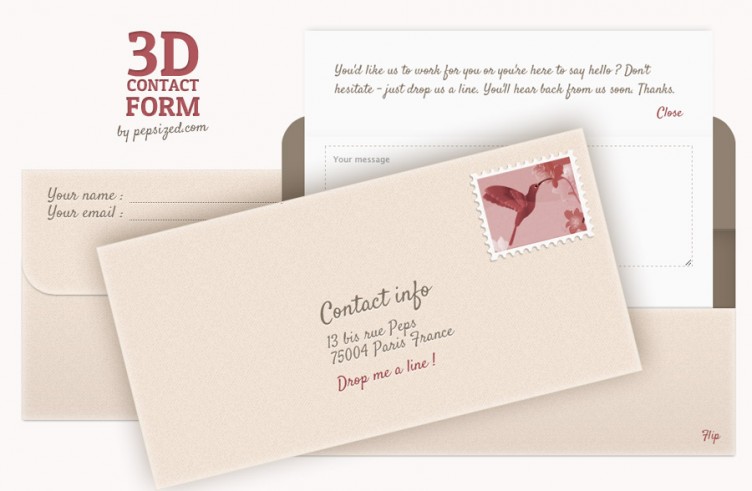
In this tutorial we will use css3 3D transforms to create a contact form that mimic a regular letter. You’ll have to flip the envelope, note your (sender’s) coordinates on its back lid, open the envelope, unfold the paper and write your message.
We’ll also make use of the :target pseudo-class so that no javascript is necessary.
Note that to enjoy the 3D behavior of this contact form, your browser has to support css3 3D transforms, check the current state of the support at “can I use.”
Step 1 – Prerequisities
If we want that our letter reaches its destination, we need a stamp. We’ll also use a subtle paper pattern for the as the envelope background.
As far scripts we’ll need the modernizr library to detect the browser’s support for the 3D css transforms.
To keep this tutorial concise, we won’t include all styling but only what is essential for the 3D behavior. For the same reason we will omit vendor prefixes.
You’ll find the complete stylesheet in the download file.
Step 2 – 3D transforms – getting ready
We have three “flips”. We flip the envelope (horizontally with the origin in the center), than we open it (we flip the lid), then we unfold (=flip) the bottom part of the letter (the two latters – vertically with the origin on the top).
In each case the basic markup would be something like that :
<div class="container">
  <div class="flip">
    <div class="front">...</div>
    <div class="back">...</div>
  </div>
</div>
We use the .container to activate the 3D space, i.e. set the perspective :
.container {
  width: ...;
  height: ...;
  position: relative; /* or absolute */
  perspective: 1000px; }
The .flip div wraps the 3d object and the .front and .back represent its two faces. The .flip must have the transform style set to preserve-3d so that its children are positioned in the 3D-space and not flattened in the plane of the element.
.container .flip   {
  width: 100%;
  height: 100%;
  position: absolute;
  transform-style: preserve-3d;
  transition: transform 1s; }
The .back and .front elements have backface-visibility:hidden to hide their back faces. Finally, we flip the .back element :
.container .flip > div {
  position: absolute;
  width: 100%;
  height: 100%;
  backface-visibility: hidden; }
.container .flip .back {
  transform:rotateY(180deg); }
Step 3 – our markup
We use 3 times the basic pattern introduced in the previous step :
<section class="container" id="contact">
   <form class="flip">
      <div class="front">
        <h2>Contact info</h2>
        ...
        <a id="flip2back" href="#">Drop me a line !</a>
      </div>
      <div id="content" class="back">
        <div id="letter">
           <div class="container">
              <div class="flip">
                 <div class="front"></div>
                 <div class="back">
                     You'd like us to ...
                     <a id="close" href="#">Close</a>
                 </div>
               </div>
            </div>
            <textarea ... ></textarea>
            <input type="submit" class="submit" value="Send" />
         </div>
         <div class="top">
            <a id="flip" href="#contact">Flip</a>
         </div>
         <div id="envelope" class="container" >
            <div class="flip">
               <div class="front">
                  <div>
                     <label for="name">Your name :</label>
                     <input type="text"  id="name" name="name">
                  </div>
                  ...
                  <a id="open" href="#content">Open</a>
               </div>
            </div>
         </div>
      </div>
   </form>
</section>
We will add the :target pseudo class to three elements : #front, #content, #message – there are four links that will switch the anchors : “Drop me a line”, “0pen”, “Close” and “Flip”.
Step 4 – Flipping the whole envelope.
We proceed as in Step 2. The difference is that .flip is initially transformed (rotateY(180deg)).
section.container {
  position: relative;
  width: 600px;
  height: 300px;
  margin: 280px auto 0;
  perspective: 1000px; }

section.container > form.flip {
  width: 100%;
  height: 100%;
  position: absolute;
  transform-style: preserve-3d;
  transform-origin: center center;
  transform: rotateY(180deg);
  transition: transform 0.7s 0s; }

section.container > form.flip > div {
  position: absolute;
  width: 100%;
  height: 100%;
  backface-visibility: hidden; }

section.container > form.flip > .back {
  transform: rotateY(180deg); }

section.container:target > form.flip {
  transform: rotateY(0deg); }
Step 5 – We open the envelope
This part is a bit tricky because we will also have to change the stack of elements. When the envelope is fully opened we want the lid to be under the letter, see the image below :

Fortunately, z-index is an animatable css property which means that we can set the delay between the switch of its values.
/* when "Close" is clicked : #the letter waits 0.5s and slides down into the envelope, the #lid waits 1s to become the top layer and to flip  */

.container#lid {
  position: relative;
  width: 100%;
  height: 50%;
  perspective: 800px;
  z-index: 2;
  transition: z-index 0s 1s; }

#lid .flip {
  width: 100%;
  height: 100%;
  position: absolute;
  transform-style: preserve-3d;
  transition: transform 0.5s 1s;
  transform-origin: left top; }

#letter {
  position: absolute;
  width: 90%;
  height: 95%;
  left: 5%;
  top: 5%;
  z-index: 0;
  transition: top 0.5s 0.5s; }

/* when "Open" is clicked the #lid starts to flip immediately, once it's flipped (i.e. after 0.5s) it becomes the bottom layer and the #letter start to slide out from the envelope */

#content:target .container#lid {
  z-index: -1;
  transition: z-index 0s .5s; }

#content:target #lid .flip {
  transform: rotateX(180deg);
  transition: transform 0.5s 0s;}

#content:target #letter {
  top: -40%; }

#lid .flip > div {
  position: absolute;
  width: 100%;
  height: 100%;
  backface-visibility: hidden; }

#lid .flip > .back {
  transform: rotateX(180deg); }

#top {
  position: absolute;
  left: 0;
  bottom: 0;
  width: 100%;
  height: 65%;
  z-index: 1; }
Step 6 Unfold and fold the letter
Here, again we will delay the z-index change.
#letter .container {
  position: absolute;
  width: 100%;
  height: 50%;
  top: 0;
  left: 0;
  webkit-perspective: 800px;
  transition: 0s 0s;
  z-index: 1; }

#letter .flip {
  width: 100%;
  height: 100%;
  position: absolute;
  transform-style: preserve-3d;
  transition: transform 0.5s 0s;
  transform-origin: left top; }

#letter .flip > div {
  position: absolute;
  width: 100%;
  height: 100%;
  backface-visibility: hidden; }

#letter .flip > .back {
 transform: rotateX(180deg); }

#content:target #letter .flip {
  transform: rotateX(180deg);
  transition-delay: 1s; }

#content:target #letter .container {
  z-index: -1;
  transition: z-index 0s 1.5s; }
I put a slightly simplified version of this contact form on dabblet so that you could easily experiment with the code. Make sure your browser supports 3D transforms.

Step 7 Other browsers
What about browsers that do not support 3D transform? We’ll detect the lack of support thanks to Modernizr and add some tweaking styling. We will hide (with display:none) all back-faces of our flipping elements. We’ll also remove all z-index transitions.
.no-csstransforms3d section.container:target > form.flip > .back,
.no-csstransforms3d #content:target #letter .flip .front,
.no-csstransforms3d .container#lid .back {
  display: none; }

.no-csstransforms3d .container#lid,
.no-csstransforms3d #content:target .container#lid {
  -webkit-transition: none; }

.no-csstransforms3d #content:target .container#lid .back {
  display: block;
  top: -150px; }

.no-csstransforms3d #content:target #letter .flip .back {
  top: -140px; }
In case of IE8 we have another problem – the :target pseudo class is not supported. One option is to add some javascript to deal with click events. We could also modify the stylesheet so that no clicking was necessary.
I hope you enjoyed this tutorial and got inspired. Looking forward to your comments. Thanks !
Terms of use :
You may use the effects demonstrated in tutorials in your own work, both commercial or non-commercial without any attribution. You may not reproduce entire nor large parts of our tutorials. The outcome of our tutorials may not be re-saled nor redistributed.


This is really awesome. Thanks for the tut!
Hi, I am a newbie and I am a little lost as to how to incorporate this into my WordPress blog. Do you perhaps have a video showing how to do it? It’s amazing! Thanks!
looks much attractive and creative contact forms and now i am practicing using your techniques to be expert in this. thanks
yeah…this is full creativity
ty for learned :D
This is pure creativity!!
A beautiful form and I love the effects. Thanks for sharing it.
its really awesome contact from , just a quick question how can i add php script that people can send me email via this awesome contact from , i have the php script but don’t know how to add it , can you please help ?
cheers,
shak
I was wondering if there was a way to start the envelope on the address side? If so, how would I change the code to reflect this change? I tried altering the code, but to no avail. Any suggestions would be greatly appreciated :) Thanks
this is absolutely amazing….please is the source free to use..? i dont mind dropping a thank you button on my page if i include this
Hello. First of all I have to say this is amazing ! It’s just that I can not make it appear on page load with the backside (the one with the stamp and “Drop me a line”) because it always opens the other side. How can I make it to behave as it is on the live demo page? Just to say that I have directly used the downloaded package, without modifying it. Thanks again!